Planning Courses

For this project I had identified some major usability problems and proposed solutions with a new design.

Course Planning Modal

To add courses to their timeline, users would select a degree requirement to plan and enter into the course planning modal. There, users could select from a list of courses that satisfied the requirement.

The course planning modal before redesign.

There were some key issues with the design and functionality, and a need to create a stronger call to action with clarity around how to use the modal. Common feedback from users indicated confusion and uncertainty.

Key Issues

  • No strong call to action.
  • Unclear how much to plan.
  • No way to modify the term after planning—a problem especially because it was unclear which term it would be planned and the potential for mistakes was high.
  • Once planned, unclear what to do next.

GOALS

  • Make it clear which requirement the user is planning for.
  • Help the user know when they’re done planning so they can move on to planning the next requirement.
  • Focus the user’s attention on the task at hand—planning courses that satisfy degree requirements.

Solutions & Updates

Term Selection

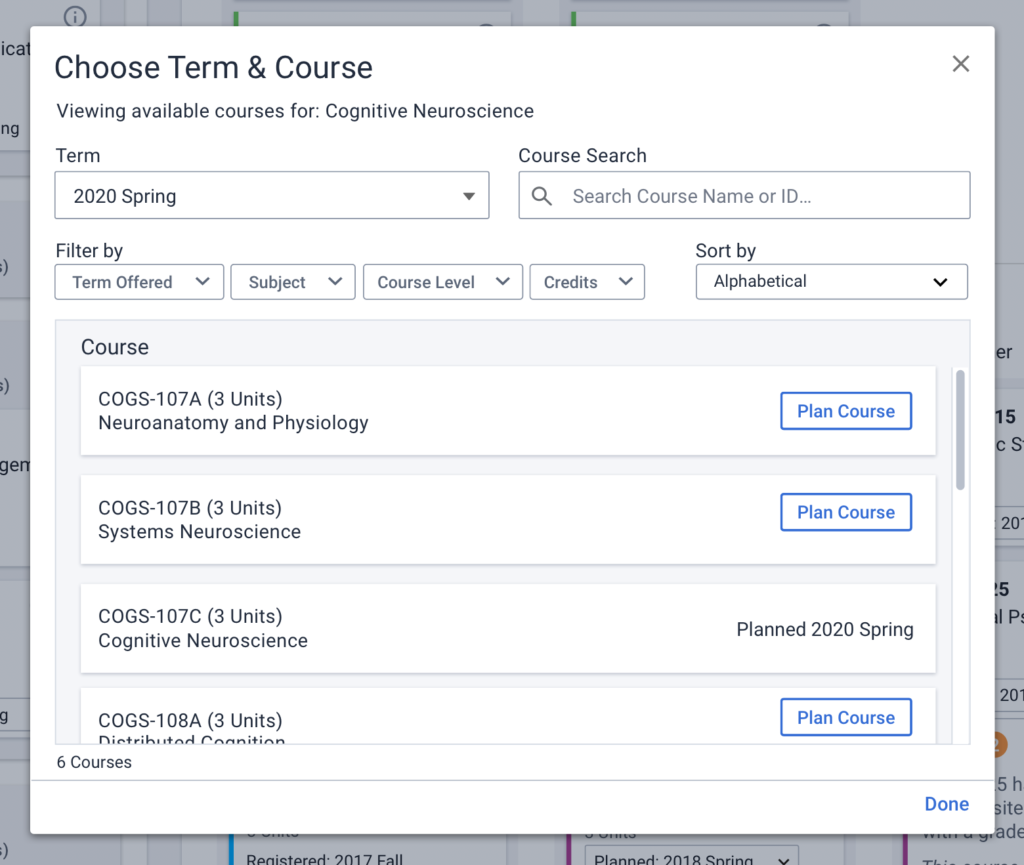
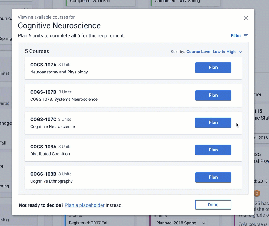
Due to proximity, users associated the term selection with the filters and thought that they were only seeing courses offered in the selected term, when in fact, they were viewing all courses regardless of term. To view courses typically offered in a specific term (spring, summer, fall, or winter), users had to use the “Term Offered” filter.

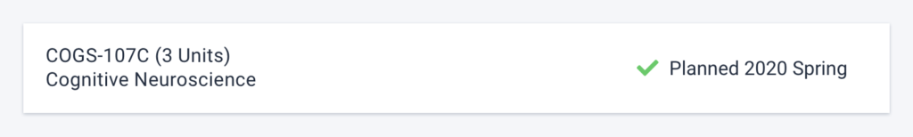
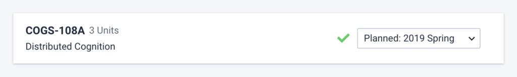
SOLUTION—Moving the term selection inline with courses and displaying it after the “Plan” button is selected helps bring the users attention to the main call to action—planning a course. It also immediately presents the user with information by telling them which term it has been planned for, and gives them the ability to easily change it.

Bonus, it doesn’t look like the user is seeing a filtered list of courses.

Close up of planned term in the course planning modal before redesign.
There was no ability to change the term once planned.
Close up of term selection in the course planning modal after redesign.
Users are allowed to change the term after planning a course.

What to Plan

It was a challenge to see what the user was planning for (look how small the requirement title “Cognitive Neuroscience” is bellow), and there was no way to know how much they needed to plan in order to satisfy the requirement from the modal. They would have to remember from before launching the modal, or exit the flow to find out—neither option is good.

Top section of the planning modal before redesign.
There was a lot of information for the user to digest and the only unique identifier was the small requirement title.

SOLUTION—By giving more emphasis to the requirement title and adding some visual hierarchy to the information in the modal, it becomes much clearer which requirement the user is planning for.

Adding the remaining units as instructions under the header provides clear directions so the user knows exactly how many courses they need to plan.

Hiding the filters behind a toggle also helps reduce the amount of information from the get-go.

Top section of the planning modal after redesign.
The title indicates what requirement the user is planning for and the instructions include how many units need to be planned.

Walking Users Through the Flow

To help the user walk through the modal, course “Plan” buttons are styled as primary action buttons while the “Done” button is in the secondary style. This helps keep the focus on planning courses to meet the requirement.

Once all units for that requirement have been planned, the buttons switch styles to motivate the user to close the modal and move on to planning another requirement.

Screenshot showing how the primary and secondary button styles work through the flow of planning courses in the course planning modal after redesign.

If a user wants to exit the modal before they’ve completely planned the requirement, they can do so by clicking the “Done” button.

The ability to plan a placeholder instead of a course is located at the bottom of the list so that the user can opt out of the flow while still making progress towards planning their degree.

Future Considerations

If I were to push this design further, there are a few things I’d want to consider.

call to action

I’m always looking to reduce repetitive content, and I would look to eliminate the multiple “Plan” buttons so that there’s only one primary call to action.

Planning Flow

I would explore the overall flow to see if there is a better way to plan courses without the use of a modal.

Course Filters

It would be interesting to see if there is a correlation between the use of filters and the number of courses displayed. If there is, I’d want to tailor the experience based on that threshold.